Thursday, March 17, 2011

Happy St. Patty's & Personality Board #18

Let's be honest. I live in Oklahoma, and it's like Hot Pink and Zebra are just now hitting their radars. In honor of my disgust with insanely bright and matchy, and today's affinity for all things green, here's a wedding I would actually have that incorporates those elements. Gerber daisies and zebra anything still don't make the cut.


{click to enlarge}

As much as I love antiqued styles, occasionally it's refreshing to see pink and green paired without beckoning the Shabby Chic moniker.

Other common trends you're seeing [and hating]?

Monday, March 14, 2011

Personality Board #17

I've recently been working on some things that are much more elegant than is my usual cup of tea, and it got me thinking about this wedding design I'd gathered...

I'd like to see ghost chairs and listen to 40's jazz at this wedding.


{click to enlarge}

Let's be serious. I'm not capable of too much elegance.

Monday, March 7, 2011

Furniture Improvement

I've recently been inspired by these pieces, apparently quote drawn to that shade.


This weekend, I have a date with the mid-century dresser in our bedroom. Martha Stewart's metallic "Aqua Pool" and I will Go. To. Town.

Tuesday, March 1, 2011

Guest Bedroom Sneak Peek!

This IS a crappy iPhone photo, but you still get a hint! Chair makeover will hopefully happen this weekend when I'm not busy working on the Symphony Showhouse or seeing the Mid-Century Furniture exhibit at the Oklahoma Museum of Art. Oh, and recovering sailboat cushions (!) for Josh McCullock. Yes, you can expect to see more details on all of those topics.


Any design projects you're working on for your house or wedding?? Tell me! I want to know!!!

Friday, February 25, 2011

Anthropologie Does Weddings?? YES.

This month Anthropologie [known for it's eclectic, expensive-but-less-than-couture artistry] launched a bridal line, and the wedding world waited in awe. I'll admit that there are some absolutely stunning pieces in it, and the idea alone of an Anthro gown sets me into a tizzy. Sadly, I'm slightly "whelmed." Maybe because it's their first line they didn't want to give it all away at once, but even with my seeming allegiance to the name, I wasn't as blown away as I planned to be. And by "planned to be" I mean that I might as well have marked their opening night on my calendar as dedicated to ohhing and ahhhing for hours, then figuring out a way to touch the things. I even had a dream one night that I found the warehouse for the dresses before their debut, and I actually went swimming in them -- not like I wore one to swim, yet rather swam through them, as if the fabric was water. Dreams....

However, you MUST check our their photography, styling and modeling. The site is gorgeous. Someone is awesome, whoever was in charge there, I mean. Also, there are some spectacular pieces. REALLY. Such as these:

Bridal:


Bridesmaids:


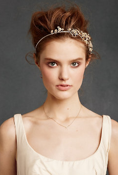
Hair Adornments:


SHEWZ:


And even the most precious cover-ups you'll ever find:

I'd like to remake these styles for my brides. That's more like it.

Thursday, February 24, 2011

Thinking Beyond Ourselves

My convictions for environmental concerns overwhelmingly outweigh my convictions about most other problems facing our planet. For this reason, I continually seek out as many ways as possible to bring sustainable methods into my life, my home and my work. Weddings and Interiors are becoming quite popular places for buzz words "eco-friendly" and therefore a crop (no pun intended) of products have surfaced, always seeming to cost more money and are terribly guilty of greenwashing.

For this reason, I was very pleasantly surprised to see a list of more practical and useful tips for greening a wedding in the most recent publication of Brides Of Oklahoma. We can thank Lindsay Gibson for putting this together, and you can check out the spread on her website. It is legit. I recommend every single one of those tips!

In our wedding, we adopted the philosophy that only what we could use after the wedding could be purchased. If I knew that I couldn't gift it, sell it or decorate with it, the guilt of purchasing something for only one day outweighed my desire to have it. Additionally, we made almost all of our DIY projects from materials I already had, such as the birdseed pouches. It was an idea that hit late at night when I was holding pretty fabric scraps that I had no plan for -- and it clicked!

A detail shot:


My friend and bridesmaid Whitney, passing them out as the reception was winding down:


You can read the original birdseed pouch post for more explanation on the process.

Any ways you're trying to go a less wasteful route or special things you reuse instead of purchasing new? I'd love to hear about it!

Wednesday, February 23, 2011

Miniature Vision, Option C

Someone do this and have fun! PLEASE!


Now that you've seen all three of the abbreviated versions of visions that begin the wedding planning process, tell me what you think! Which would you choose for yourself? Which do you think is the most current?

Living Room Progress

Ah, yes. Rearranging a room is powerful. Completing it is even moreso, but I wouldn't know!

In the mean time, I did a crap ton of work last weekend in this space. Having Fridays off is a money in the bank, metaphorically, obviously.

The last you saw of the living room was then.

I started with this, and it bugged me mercilessly. While definitely the best angle for watching tv, which Brandon really enjoys, walking in to the back of the couch seemed really defunct to me. With such and open floor plan, it's a waste to close off that large doorway, especially since it's the first thing you see when you walk into the house.

I convinced myself that maybe it was just the really disproportionate [and all-the-while temporary] placement of the green chairs in there, so I tried this. BIG fail.

Then I resorted to a technique I'm not proud of -- "What did the last homeowners do in this room?" They had a curved sectional placed underneath the bay window with two chairs facing it. Beautiful layout, yes, but we knew it would really limit comfort when watching tv. I really liked this idea though because I knew it would allow me to bring the minimalist loveseat back in here, almost doubling the seating allowance. So, on the way to place the couch under the window, I unintentionally paused at the diagonal, and was instantly sold. BOOM.

Tv watching is very possible. There's more seating. The room flows more appropriately. There's not an awkward blank space under the window. It doesn't feel empty or overcrowded, either. Only down side? Brandon really doesn't like it! Eeeeek. He says it covers the entertainment center too much, and makes it look like an afterthought... :-(


And in the evening...
Why yes, I realize that those frames don't have art in them yet, that the lamps aren't even (more on that soon), and that the dining room chairs are draped in fabric. My b.

What are your feelings on the new arrangement? See any other possible plans we aren't considering?

Pages

See those little tabs right about the top post, under the header? I've been adding "Pages" to the blog to help reference special things done in the past here. Wedding, Ark and About Me are up and running while the others are still under construction.

What do you think? Useful? More like a real website? Not worth my time?

Chime in!

Miniature Vision, Option B

Remember the plan to give examples of Visions? Here is the second -- and boy, is it bright?! This entire wedding was built around the chair seen on the second page. With a piece that's that much fun, how could the rest of it not continue that whimsical but elegant electricity?


Sharing option 3 this afternoon! Think Pencil Bouquets...

Sam Lamb's Gnome Granary

How she had it looking about a week ago...


And now!

Scoot on over to photographer Samantha Lamb's website to follow the progress of her granary renovation. It's quite fantastic, truly. Once an actual granary, it fell out of use, then into the hands of hoarders! She has absolutely worked like madness, and deserves for her first finished project in there to have turned out so well. Favorite. Library. Ever.

I love that this is all scrap wood that she's repurposed, and to showcase antiques, no less! I'm horrible at provoking the "primitive" vibe, but she is a genius. Her photos will lure you and mess with your dreams they're so beautiful. Her gnome lamp is now on sale at Urban Outfitters! Gnomes, of course, because that is the inspiration for her sweet little guest cottage.

More to come on adventures with Sam. We spent last weekend rummaging through scrap and stump piles (in Hobart, Oklahoma, no less) when not working in this sweet little granary. I might have trespassed??? Hopefully not, and ignorance is bliss.

Later on, we're thinking painted "rugs" on the floor, some fantastic thrifted and upcycled furniture, a wood-burning fireplace, and even more warmth!

Tuesday, February 22, 2011

Miniature Vision, Option A

As I mentioned here, I'd like to share some abbreviated versions of the Visions (say that three times fast) created for brides and families, so everyone can really be on the same page.

Option A was built from a candle. Yes, a candle. A bride brought the votive on page three and asked for her wedding design to mirror that style, but to be more formal and timeless.


I included two bridesmaid looks, as often those hues can't be determined before choosing a venue.... and because I really love coordinated ladies over matching ones.


This can't be your favorite yet, because there are still two more to come. Look for Option 2 in the morning!

All attire shown is J.Crew, with the exception of the last ties, found at Etsy shop Toybreaker.